A1
Client-First
Flat, readable class names with page prefixes and shared components.
Tessel is a calm SaaS theme for Astro. Three homepages, three pricing and three contact layouts, CMS templates for blog, careers and integrations, and every utility page a site needs.
Each home leads with its own isometric idea. Hover a card to scroll the full page.
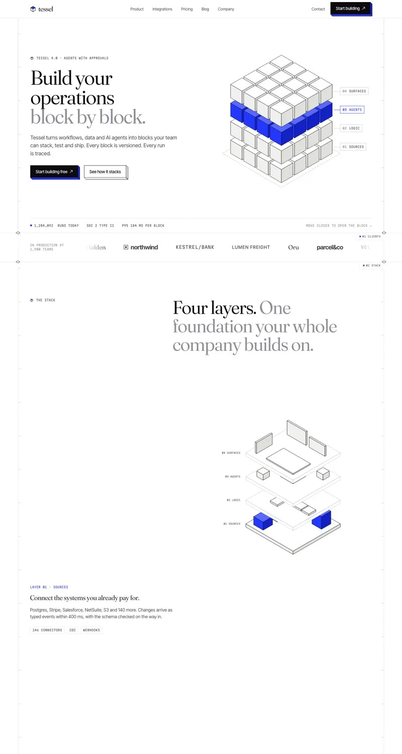
A 4×4×4 isometric block that opens toward the cursor, an exploded layer stack, an iso chart and a click-to-build CTA.
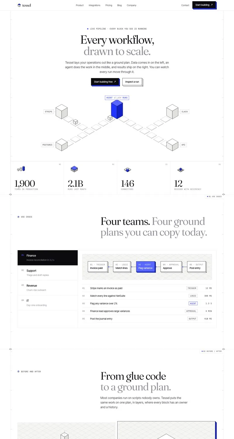
A live isometric pipeline in the hero, use-case tabs with step diagrams, a run inspector and a connector grid.
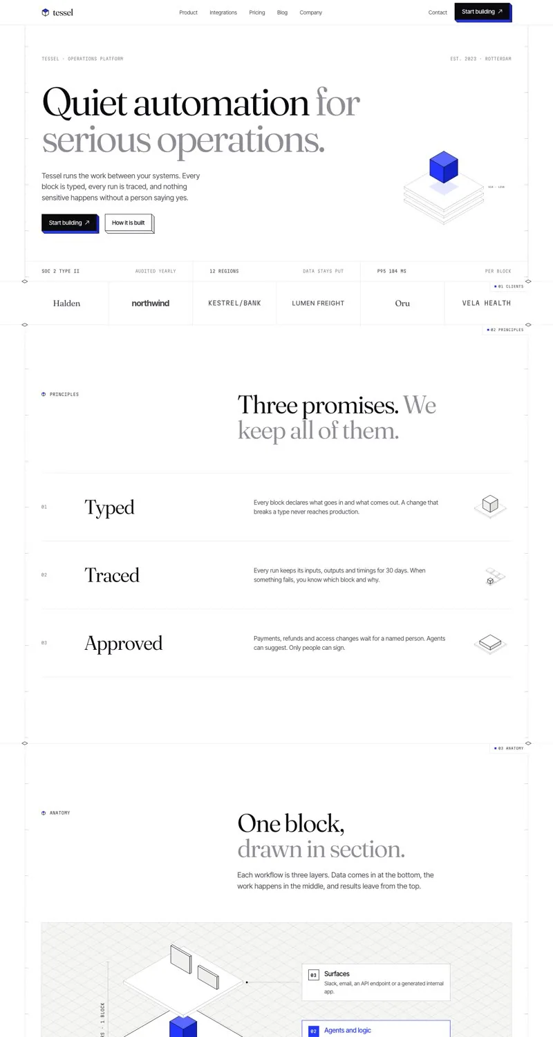
Oversized type, one floating cube, three principles, an anatomy drawing and plenty of white space.
Pick the pricing and contact layout that fits the product, or keep all six.
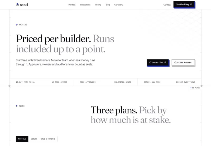
Monthly and annual tabs, three plan cards, a full comparison table and usage pricing.
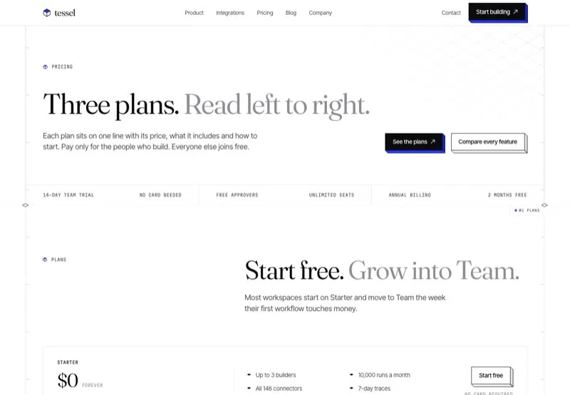
Each plan on one full-width row, an "every plan includes" grid and a two-column FAQ.
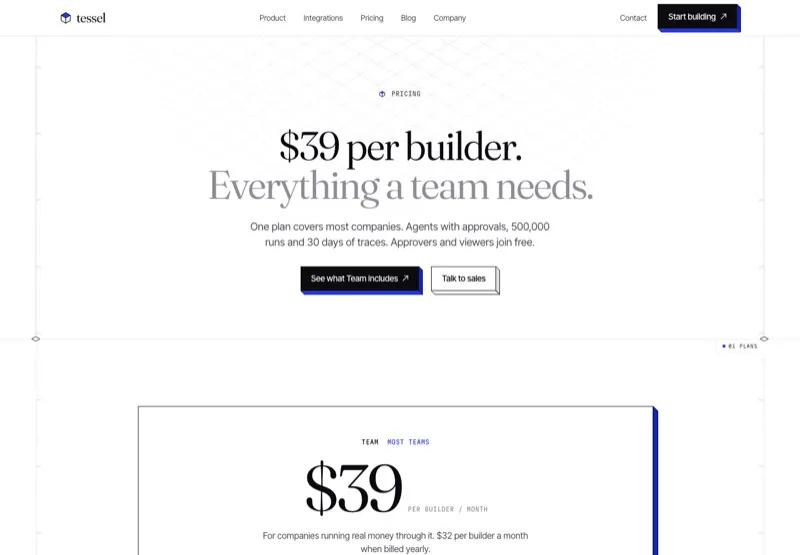
One large Team card, two compact plans, per-plan tabs and an Enterprise sales form.
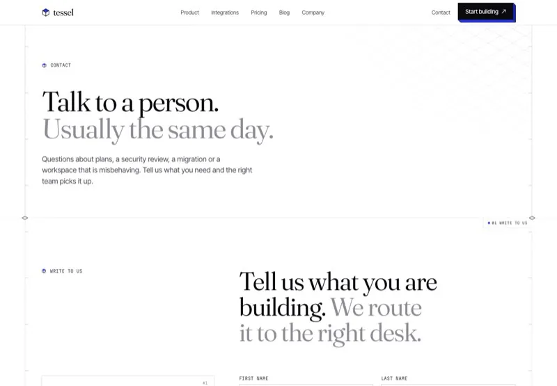
Contact desks beside a full form with topics, team size and consent, plus a short FAQ.
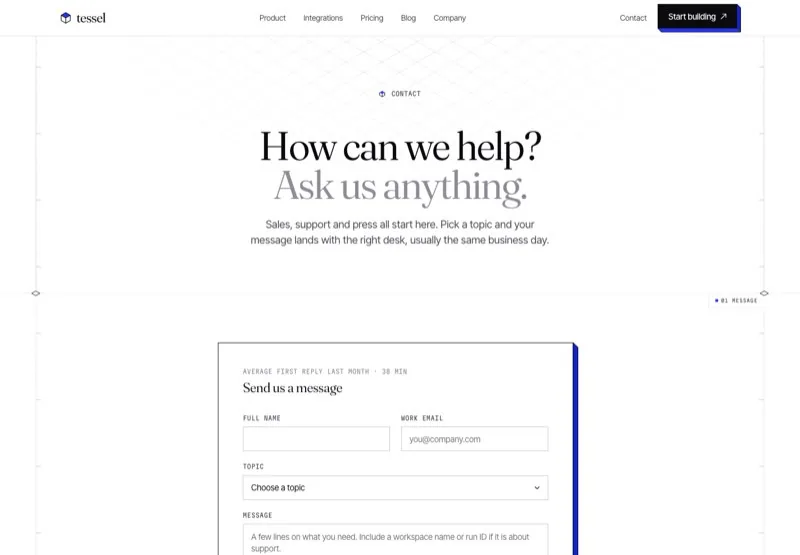
A centered hero and form card, three desks with reply times and two office cards.
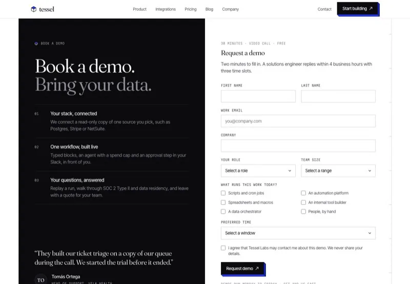
A dark split panel beside a demo request form and a four-step "what happens next" flow.
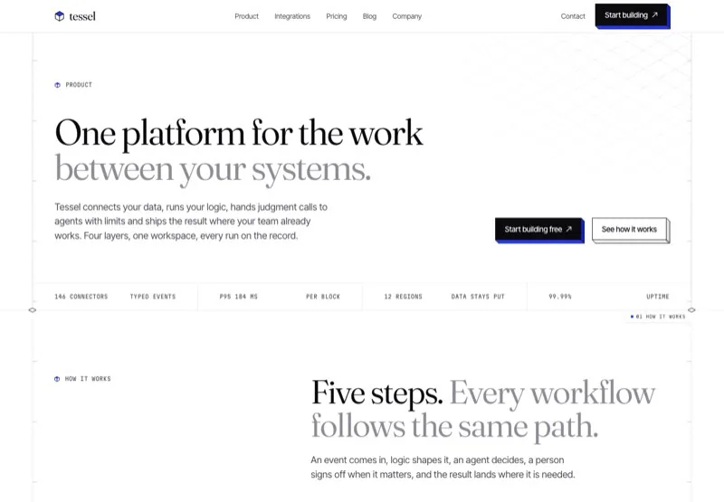
How it works, the four layers, agent guardrails, traces and security.
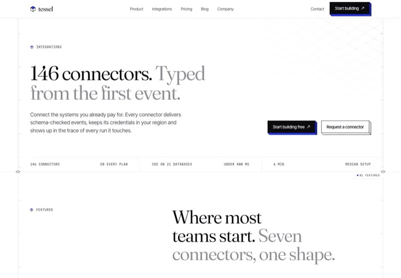
Seven featured connectors with category filters and a request form.
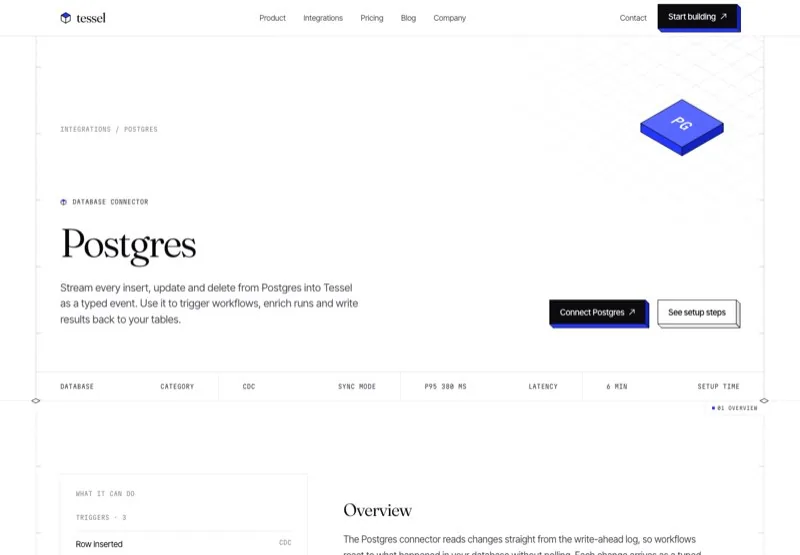
Overview in Rich Text, triggers and actions, setup steps and related items.
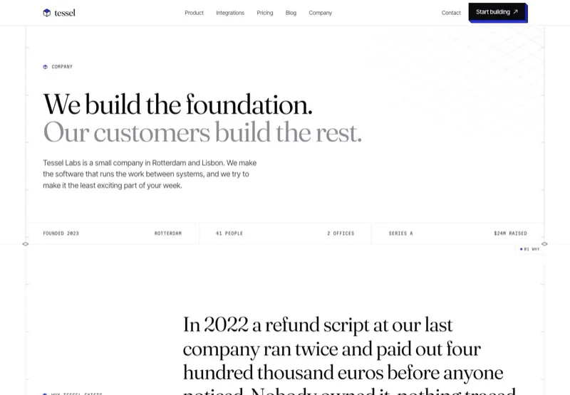
Story, values, numbers, a 2023 to 2026 timeline, team and offices.
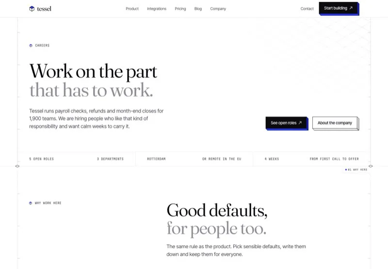
Perks, how we work, open roles with department filters and the hiring flow.
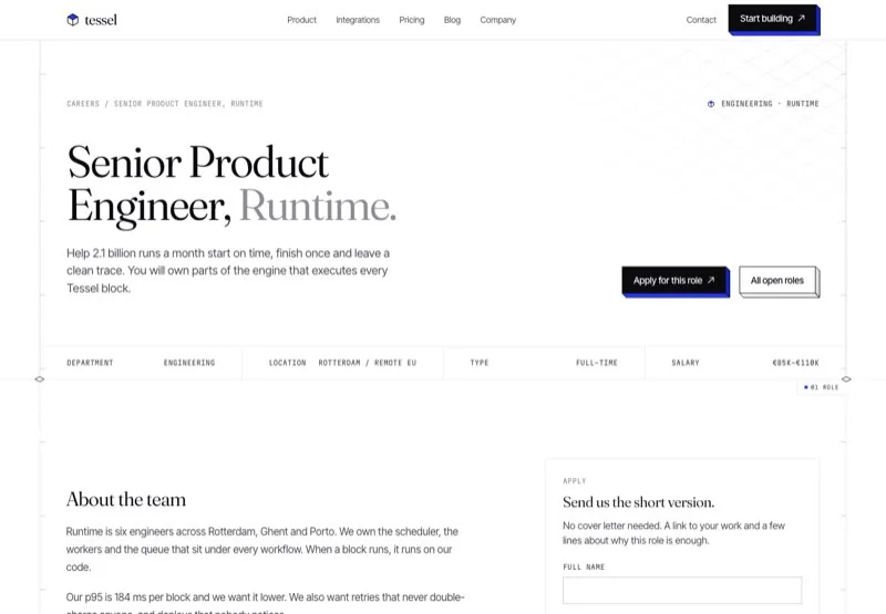
Role description in Rich Text with a sticky application form.
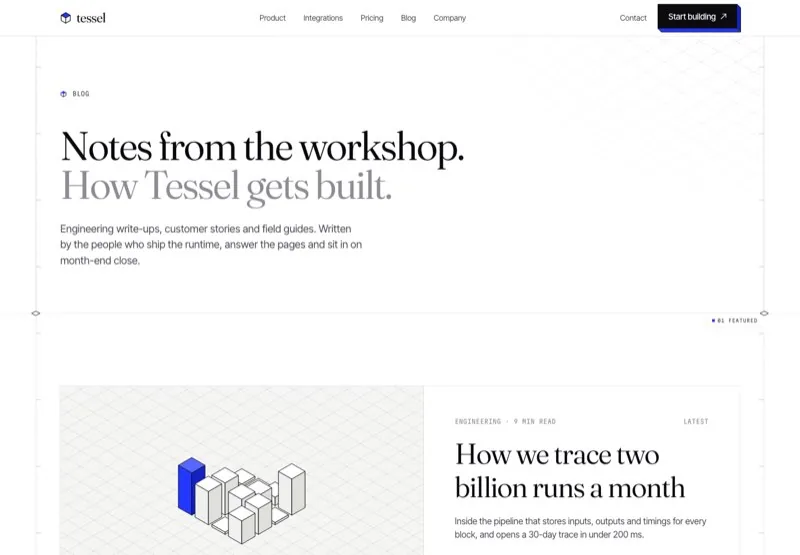
A featured post, topic filters, six post cards and a newsletter strip.
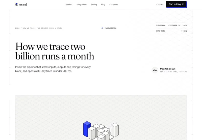
Article with table of contents, code, quote, author card and related posts.
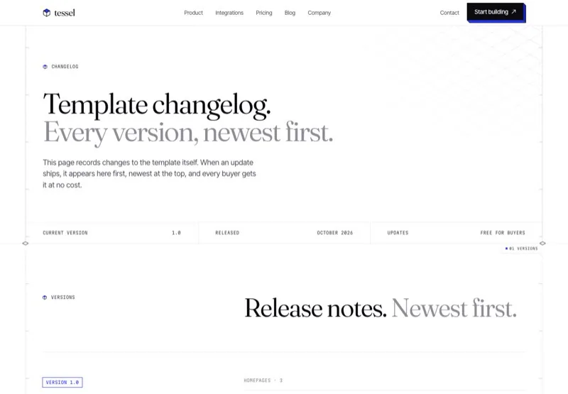
Every version of the template, newest first.
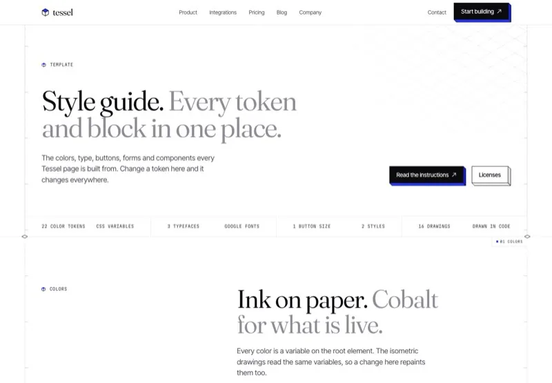
Every color, type style, button, form element, component and drawing.
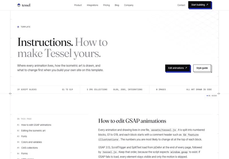
How to edit the GSAP animations, the isometric art, fonts, CMS and forms.
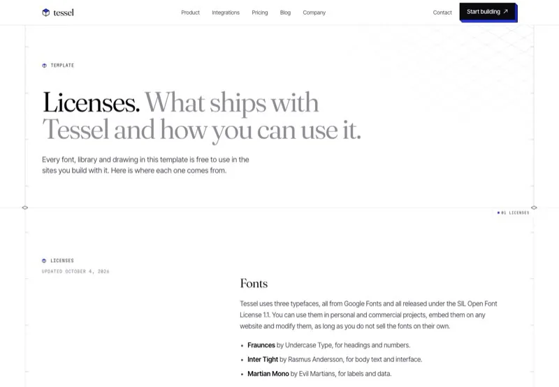
Fonts, GSAP, illustrations and icons used in the template.
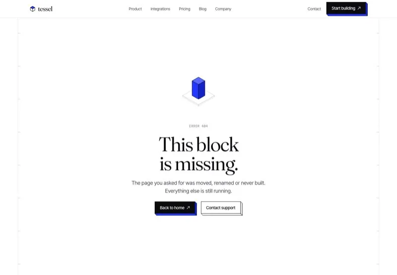
A missing block, with a way back home.
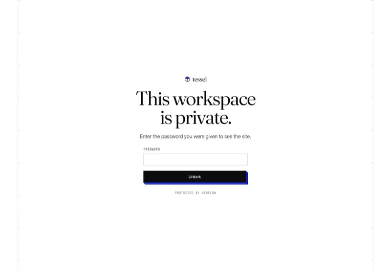
A private workspace gate built on the native password form.
Flat, readable class names with page prefixes and shared components.
Every color, font and size is a variable. Change the accent in one place.
Blog Posts, Jobs and Integrations, each with a template page.
Numbered blocks, data attributes and reduced-motion support.
Drawings are generated from a few helpers, crisp at every size.
Contact, demo, newsletter, application and password forms.
Tuned at 991, 767 and 479 with no sideways scroll.
A style guide and an instructions page ship with the template.
Every page shares one set of classes, variables and components, so a change in one place carries through the whole site.